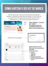

The quick answer: The typographic hierarchy in Canva is established by the clear differentiation of size, weight and spacing between Headings, Subheadings and Body Text. The innovation lies in the practical automation of guiding the reader's eye, ensuring that the most important information is consumed first, which avoids visual clutter and increases the retention of your message.
1. The visual voice of your text
In everyday life, the mistake that most detracts from a professional's authority is using the same font size for all information. Innovation lies in understanding that the font is the “voice” of your brand: straight, modern fonts convey agility, while serif fonts convey tradition. Our team is here to show you that by defining what is headline and what is text, you make life easier for your customer, who can “scan” you and understand your offer in a few seconds.
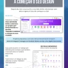
2. The secret of breathing and contrast
Text that is too close together or glued to the edges creates discomfort that makes the reader give up on the post. The innovation lies in the correct use of spacing between lines and letters. In Canva, increase the line spacing slightly so that the text “breathes”. Also, make sure that the color of the font is easy to read against the background. If the background is dark, use light letters. The practical innovation is to ensure that your content is accessible and readable even on small mobile screens in bright sunlight.
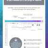
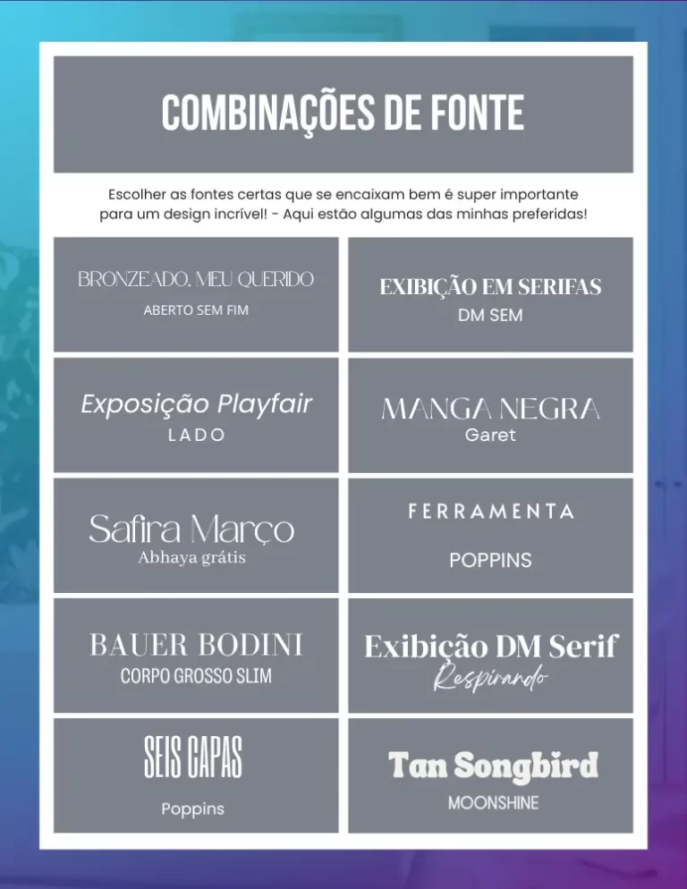
Avoid using more than two different font families in the same project. The practical innovation is to use variations of the same font (such as a Bold version for titles and a Light version for text). This creates a sophisticated and professional visual unity, preventing your design from looking amateurish due to too many conflicting styles.