

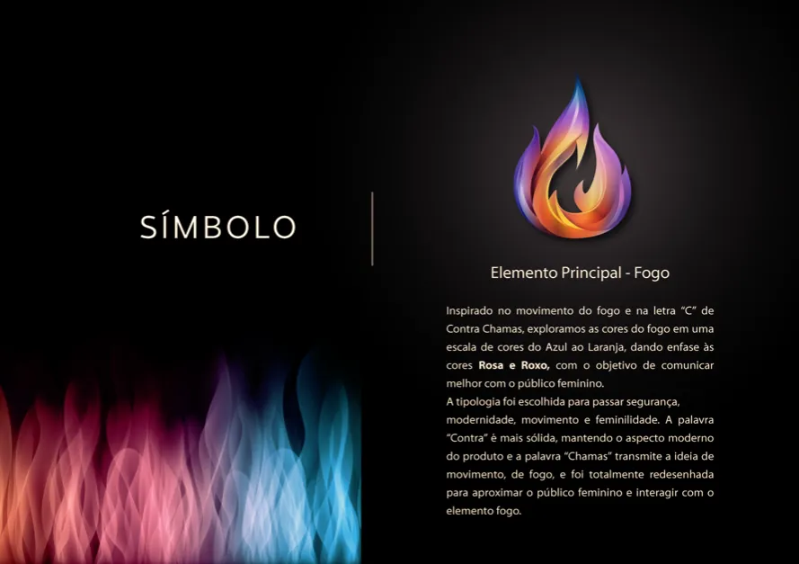
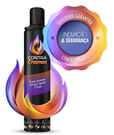
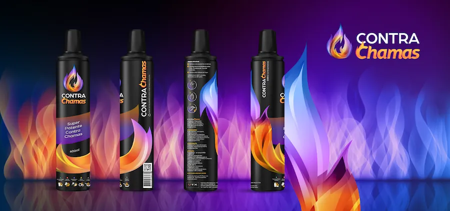
The ByMariana methodology focused on transitioning the concept of fire into a solid and agile brand language. The visual structure enabled effective communication with both female and male audiences through a technical and precise color palette:
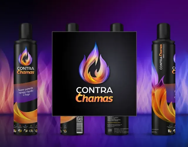
- Logo and Branding: A typeface that balances strength and movement, redesigned to bring the brand closer to its female audience.
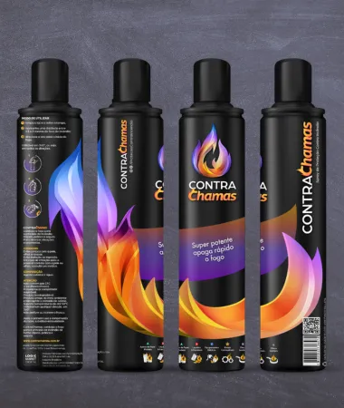
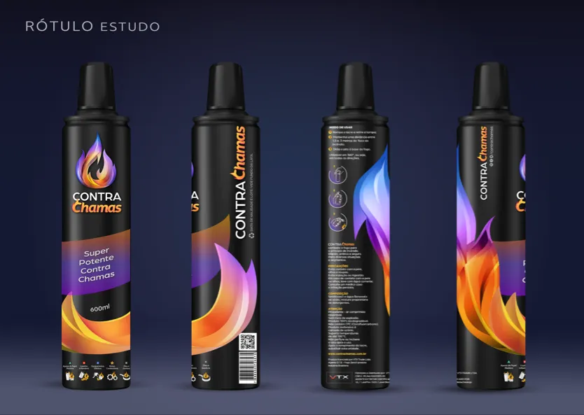
- Continuous Label: A design featuring brand repetition and a focus on ensuring the text remains legible from any angle, thereby reinforcing the brand identity.
- Technical Label: Comprehensive, educational, and detailed information, with a focus on clarity for consumers of safety products.
- E-commerce: Design Framework for Sales Packages (kits (1 to 3 products) in landing pages.
- Motion Design: Video teaser a 3D animation created for the campaign launch.
Conquest and Transformation
The project gave Contra Chamas an innovative identity that elevated the product from an everyday item to an indispensable safety product. The brand architecture conveyed a sense of urgency and professionalism, allowing the company to position itself with authority in both the digital and physical spaces. The transformation delivered by ByMariana ensured that the brand not only sold protection but also established itself as the technical benchmark in the market.